


Custom photo illustration texture I developed for an in-store installation that had high visibility and very specific dimensions.
Finished and installed in modular sections.
Detail on the print, texture, and modular layout.
Look and feel for a campaign I developed after receiving these awesome photos from the field.
Style I developed for large in-store murals that allowed for lots of customization at each location worldwide.
Developed this to be the headers above the nylon section in retail locations. I wanted to showcase the range of colors offered.
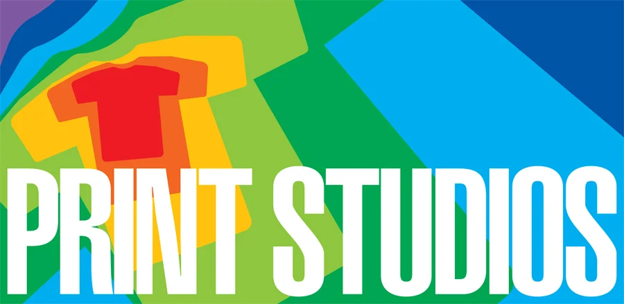
At our HQ there was a print on demand studio for apparel and this was the rebrand I developed for them.
We had an amazing team of photographers and putting together these displays for stores was one of my favorite project categories.
Catalogue insert style vignette.
Loved being able to play with scale and big type inside the AA brand identity.
These print pieces were always fun to put together and explore photo treatments and type layout.
The brief for this was for a location in Israel that had a very strange store layout with difficult dimensions for displays. Was a fun challenge to fit something there and really was happy with the result.
Had the opportunity to make several of these posters which allowed for iteration and improvement.
The grid was a staple at AA and it worked well here to tie this photoset together which was used as an in-store display.
Photo illustration for catalogue.